Thursday, 27 September 2012
research and planning: finished contents page
This is my finished contents page, I have linked it with the front cover so it is obvious they are from the same magazine. I have the same style of font on the masthead and the same sort of idea with the main image.
Tuesday, 25 September 2012
Monday, 24 September 2012
research and planning: college magazine evaluation
 The font sizes on both my front cover and contents page I feel are appropriate, as they are noticeable from their headings, yet don't over power the whole pages. The mastheads on both the contents page and front cover I feel are large enough to catch peoples attention but still fits in nicely with the whole layout of each page.
I have tried to follow the three colour rule, but I found it difficult to find three colours I was happy with that would look good on each page. So I used the three colours of light blue, brown and pink on my front cover, but only brown and pink on my contents page.
I think you can definitely tell both pages are from the same magazine as the masthead are the same front and colour, the heading of the stories are the same colour and front as the page numbers on the contents page, the main image on both pages are of the same style; both girls dressed in black and playing with their hair but one is a medium close up which i was asked to do on my front cover and the other is a medium long shot, but they are of two different girls to keep the readers interested.
I think the pictures I have took are of an okay standard as this the first time I have taken professional photographs in medium close up, but if you look at all the other pictures I have taken and chose not to use, they have some problems with them i.e if they aren't a medium close up or I felt they just didn't fit in with my magazine well enough.
I think there are enough stories on the front cover to interest the readers and want them to read further into to magazine, but not tell them all the stories on the front cover so that they don't need to read inside, and I think all the stories are appropriate for this magazine. However I feel I could have put more stories on my contents page as I feel it looks a bit bare and traditionally magazines have more pages than just 21.
Sunday, 23 September 2012
research and planning: finished college magazine front cover
This is my finished front cover for my college magazine. I have changed my front cover so much from my draft because when I did the interviews about my front cover a lot of people said to maybe change it a little so I took into consideration what they said and changed it a little.
Saturday, 22 September 2012
research and planning: college magazine photographs
These are the pictures I took for my college magazine, as you can see some aren't a medium close up, and some I didn't feel fitted in well enough with my front cover.
Friday, 21 September 2012
Thursday, 20 September 2012
research and planning: Audience interview answers
- The people I interviewed said to maybe put something about film in there and general news in the college. So I took that on board and I have a section on film and student services.
- The colour scheme was mentioned and said that it maybe should be changed to make the masthead stand out. So I will be taking several more pictures of my model with different backgrounds to see which benefit my masthead the most.
- Someone said to have the magazine free as students don't normally have a lot of money to throw around, yet some said to make it priced around 30p so the copies I do sell it may bring a profit in to the college. But I have decided I will have the magazine free as if it was me I wouldn't be willing to to pay especially a magazine I am not used to reading.
Monday, 17 September 2012
research and planning: interview questions
- What stories would you like to read about in the college magazine?
- Do you think the colour scheme is appropriate? What do you think about the natural theme of it?
- What do you think of the masthead? Do you think its appropriate? If not what to change it too, if so why?
- Do you think I should make the magazine free? If so why?
- Would you be interested in reading a college magazine, why?
Thursday, 13 September 2012
research and planning: medium close up examples
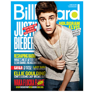
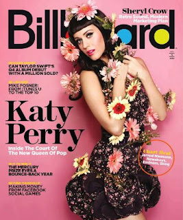
I understand that these pictures are medium close ups and I will need to used a medium close up for my college magazine.
research and planning: college magazine analysis
research and planning: film review
Firstly I found a film review of my choice on Google, then pasted that into a word document. Then I save the picture for the film onto my desktop. I opened In Design and in that opened the film review, I placed the words into columns and the placed the picture with the words. I created a title and used the stroke tool to give it a black outline and then I coloured the whole of the background in.
Wednesday, 12 September 2012
research and planning: film poster
I uploaded the twilight film poster onto Photoshop and also the picture of Justin Bieber I used the magnetic lasso tool to cut around Justin's face, then I placed it over the face of Bella from twilight, then I used the rubber tool to rub out the bits of Justin face that didn't fit onto Bella face. I then changed to colour of Justin's face to fit the colour of Bella's.
Tuesday, 11 September 2012
research and planning: photoshop challenge
First I opened an A4 document to work on. Then typed in 'AS Media Studies' in Century Gothic in a size 24 font. Then I centered the text and changed the colour to red and gave it a drop shadow. I changed the background to blue and placed a picture of a person of my choice under the text , cut around him with the magnetic lasso tool then changed his hair colour, and made a boarder around my work.
Monday, 10 September 2012
research and planning: skin tutorial
Firstly I used the spot healing brush tool to get rid of all the blemishes on my models face, I used the smart blur tool to get rid of all the shine on her face, then the add layer mask to look more natural and make her eyes stand out more. Then I changed the colour of her hair to a more natural brown. Then I finely drew on her eyebrows to define the eyes more, I gave her eye make up and some bronzer for her cheeks. Some nice natural pink lipstick and also whitened her teeth and the white of her eyes to make them stand out more.
research and planning: photoshop tutorial
First I selected the circle tool and cut out the CD and placed it on top of the music sheet background, I then changed the colour of my CD. Then I cut out all of the white background from the horn image and then placed that also on top of the sheet music background and the CD. I then placed the music notes above the horn from the layers pallet, I changed the size of the CD, horn and music notes and rotated them also. I then used the text tool to write my name on my CD cover, I changed the size and color of it and then added a shadow effect to it, finally I distorted the sheet music background to look more interesting.
Subscribe to:
Comments (Atom)


+copy+10.JPG)
+copy+2.JPG)
+copy+3.JPG)
+copy+4.JPG)
+copy+5.JPG)
+copy+6.JPG)
+copy+9.JPG)
+copy.JPG)
.JPG)

+copy+7.JPG)


